Your MM Platform comes with a selection of visual themes. Each theme is a design for your website, a way of presenting your website's content to site visitors and members. It is possible to change the entire look of your site quite easily, and which theme you choose is simply a matter of personal preference. As standard, all MM Platforms are set up using the Stockholm theme.
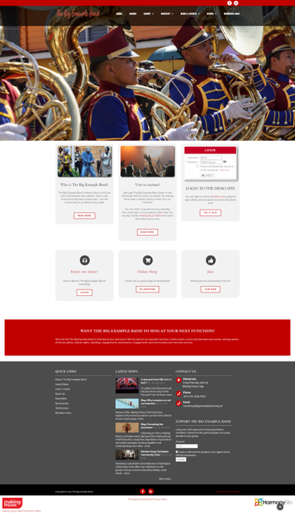
The newest theme the developer has created is called the Mercury theme. It is an elegant theme that sits well with modern web fashions with the home page slideshow taking up the whole screen. Similar to the Stockholm theme, the Mercury theme is mobile-friendly which means that viewing and navigating the groups Platform on a mobile phone or tablet will be seamless.
The theme looks like this (on our Demo site). Naturally it will look different with your logo, colours and photos.

What is the process for changing to the new Mercury theme?
You have two main choices for changing themes:
- You can do it yourself - if you are comfortable with basic HTML skills. Full details on how to do it are below, but the basic steps are:
- Select the new theme in the website configuration
- Upload a new logo
- Replace the photos in your slideshow with new versions that have a different size
- Replace the HTML in your Home page (we provide the new HTML, below). This requires a basic competence with HTML (not expert).
- Replace the HTML in your site footer's Contact Us area (we provide the new HTML, below)
- Replace the HTML on your Contact Points page (we provide the new HTML, below)
- Or the developer can do it for you. This will costs a one-time fee of £30+VAT if you would prefer the developer to do this process for you.
What do I need to get started?
No matter whether you choose to do it yourself or ask us to do it, before any changes can be made, you should read the following checklist:
1) Logo. The first thing you may need is a new logo. In the new Mercury theme, the logo will be sitting on a black background. This is a departure from the other themes, where the logo sat on a white background (or you had two versions of your logo - one for a white background and one for a dark/black background). So your logo should not have any black in it - the black won't show when the logo sits on a black background.
By way of illustration, here is an example of a suitable logo:

Note that it's a transparent logo, with no black in it. Here's what it looks like when the same logo sits on a black background

Here's an example of a logo that's NOT suitable (note this is a different logo from above)

Note it has a few black elements. It looks fine on a white background (above), but on a black background it doesn't work

So you may need to create a new version of your logo. You will need the logo to be:
-
- PNG format (GIF is also fine)
- Transparent background
- Little or no black
- Anti-aliased to look good when placed on a black background.
- Landscape layout
- Around a 3:1 aspect ratio is ideal (e.g. 300 x 100 pixels). Variations on this are fine
- The size should be no bigger than around 150 pixels high
2) Home page slideshow photos. If you are currently using the Stockholm theme with the full-screen slideshow format, then you don't need to change any slideshow photos - your existing photos will be suitable for the new theme.
If you're not using the Stockholm theme, or are using Stockholm with the regular slideshow format (where each slide/photo is exactly 1150 x 448 pixels), then you will need to change your photos. You would need to go back to the original high-resolution versions of the photos in your existing slideshow and create new versions - crop/resize the originals anew to be suitable for the new theme. Or you can simply start with entirely new photos.
In the Stockholm theme, with the regular (non-full-screen) slideshow layout, each photo needed to be exactly 1150 x 448 pixels, In the new theme, slideshow photos should be approximately 1200 x 800 pixels in size. If each photo has an aspect ratio of about 4:3 or 3:2, and its width is between 1000 and 2000 pixels, then it should be fine.
Every other aspect of your site will automatically adjust itself to the new theme - with three manual changes required by you (see below).
Instructions for adopting the new Mercury theme
If you prefer to do this yourself, here are the full step-by step instructions for changing themes.
Note that we have designed these instructions so that if you change your mind or get stuck at any point, you can reverse your changes and go back to the previous theme.
Ensure you're logged in to your MM Platform with full Webmaster privileges before beginning:
Step 1. Switch on the new theme
- Click the cog icon in the top-right corner of the site
- On the Website Setup and Configuration page, click the top cog icon next to where the type is Making Music Platform
- Click the Appearance tab
- Make a note of your existing Visual theme
- Change the Visual theme to Mercury
- Acknowledge the information box that pops up
- Scroll to the bottom of the page and click Save
The new theme will take effect instantly.
Step 2. Home page slideshow photos
Visit your home page. If your previous theme was Stockholm and you were using the full-screen format of the slideshow, your slideshow may look fine. If so, there is nothing else for you to do in this step.
If you were previously using the Stockholm theme with the non-full-screen slideshow layout, or any other previous theme, then you'll need to change each of your slideshow photos. For each photo, you'll need to do the following
- Locate the original high-resolution photo (on your computer - not in your MM Platform
- Make a backup copy
- Using some photo-editing software, crop/resize the photo so that it's approximately 1200 x 800 pixels.
- In your MM Platform, click the Admin link top-right
- Click the link called Banners (home page) (on the Website Content line, in the middle column)
- Locate the slide that corresponds to your photo, and click its Update button
- Find the spot to replace the existing photo with the new one you've just prepared
- Click Save at the bottom
Step 3. Remaining home-page content
As every MM Platform is different, the remaining content on your home page may not look right. If the home page looks fine to you, you can skip this section.
The rough process for updating your Home page is:
- Save a copy of your existing Home page content (HTML), into Notepad or similar
- Copy and paste our default Home page content into your Home page (link below), overwriting what's there
- Bit by bit, copy your saved Home page content back into the page,
Note that this requires you to have a basic competence with HTML.
The full process is as follows:
- Visit your home page
- Click the edit button in the bottom-right corner
- Click the Content tab
- On the big box that contains all the existing content of your home page, click the Source button in the toolbar
- Highlight all the HTML source code (Ctrl-A) and copy it (Ctrl-C). Open up a simple text editor, like Notepad, and paste it (Ctrl-V). Save it - you will need it in the latter steps
- Ensure that you're still in Source view
- Click this link: New home page text It opens in a new window.
- Highlight all of the text (Ctrl-A) and copy and paste it into the Source view of the page contents box, overwriting any text in there already
- Switch out of Source view to see what the new content looks like (by clicking the Source button again)
- It will look better if you click the icon to view the editor full screen - the icon looks like this:

- This is the tricky step. This is where you need your HTML skills. Bit by bit, copy the content from the safe copy of your actual content (above), and paste it into the right place in your Home page. You can do this either in Source view or in regular view, whichever makes more sense to you. Be sure to copy only the useful content from your saved backup - not the entire HTML code! Unless you're an expert at this, you are likely to make mistakes. Feel free to use the undo system (Ctrl-Z), or revert back to an earlier saved version and start again.
- Click Save at the bottom when you're done.
If you have trouble with any of this, please do contact us at platform@makingmusic.org.uk.
Step 4. Contact Points page
Your existing Contact Points page will also need an update.
The process is very similar to what you just did with the Home page (above):
- Visit your Contact Points page
- Click the edit button in the bottom-right corner
- Click the Content tab
- On the big box that contains all the existing content of your home page, click the Source button in the toolbar
- Highlight all the HTML source code (Ctrl-A) and copy it (Ctrl-C). Open up a simple text editor, like Notepad, and paste it (Ctrl-V). Save it - you will need it in the latter steps.
- Ensure that you're still in Source view
- Click this link: New contact page text it opens in a new window.
- Highlight all of THAT text (Ctrl-A) and copy and paste it into the Source view of the page contents box, overwriting any text in there already.
- Switch out of Source view by clicking the Source button again
- Switch into full screen view (as per screenshot above)
- Again, bit by bit, copy the content from the safe copy of your actual content (above), and paste it into the right place in your Contact page. You can do this either in Source view or in regular view, whichever makes more sense to you.
Be sure to copy only the useful content from your saved backup - not the entire HTML code!
- Click Save at the bottom when you're done.
Again, if you have trouble with any of this, contact us on platform@makingmusic.org.uk.
Step 5. Contact Us box - home page footer
The Contact Us section of the footer of most public-facing pages also needs a tweak.
The process is similar to the previous two steps:
- Click the "cog" icon in the top-right corner of the site
- On the Website Setup and Configuration page, click the cog icon next to Making Music Platform
- Click the Footer/Sidebar tab
- In the Footer section, locate the Text for contact slideshow area field, and click its Source box
- As before, copy all the code there and paste it somewhere safe
- Click this link: New contact footer box text it opens in a new window.
- Highlight all of the text (Ctrl-A) and copy and paste it into the Source view of the Text for contact_slideshow area field, overwriting any text in there already
- Switch out of Source view by clicking the Source button again. No need for full screen mode this time.
- Again, bit by bit, copy the content from the safe copy of your actual content (above), and paste it into the right place. You can do this either in Source view or in regular view, whichever makes more sense to you.
Click Save at the bottom when you're done
- Return to the home page to examine the results
Again, if you have queries with any of this then please do contact us on platform@makingmusic.org.uk.


